Sometimes ideas appear in one's head, and some of these just have to turn into a passion project. Hidden Tales is one of those gems. In August 2019 whilst playing a board game with my parents, the idea popped in my head: To create a medium to tell the inspiring stories of our fellow university students to inspire them to engage in their communities. Instantly, I gathered people with similar interests and different skills to get their input. They were on board, and before we knew it, we hosted a sprint to get our story straight.
The Golden Circle
We were certain, we had to understand our purpose (why), method (how), and medium (what) to create the best product possible. With sticky notes and sharpies, we filled up a whiteboard before boiling it down to our gameplan.
Why?
We want to share stories from current GCU students and staff who are doing amazing things. We want to inspire and motivate.
How?
Storytelling. We will do this by talking directly to those we want to feature and gathering photos of both them and their successes.
What?
An anonymous digital magazine. We will use Instagram to promote it and source potential people to feature.
We are...
We are cheeky and upfront. We are grounded and relatable. We are passionate and motivational. We emphasise community. We champion the underdog.
Moodboard
An open visual identity
We explored many names. Some of which were: The Anon. Undercover. NDRCVR. Untitled. Hidden Tales.
We were inspired by Little White Lies and the variety in their look. We wanted to create a black and white-base, so we could add any colour palette to any edition.
Three designers and a social innovator
Most of us are not content creators yet for this project, we found people, interviewed them and wrote their articles ourselves. This was a challenge, but it developed our skills for writing copy with a specific tone in mind.
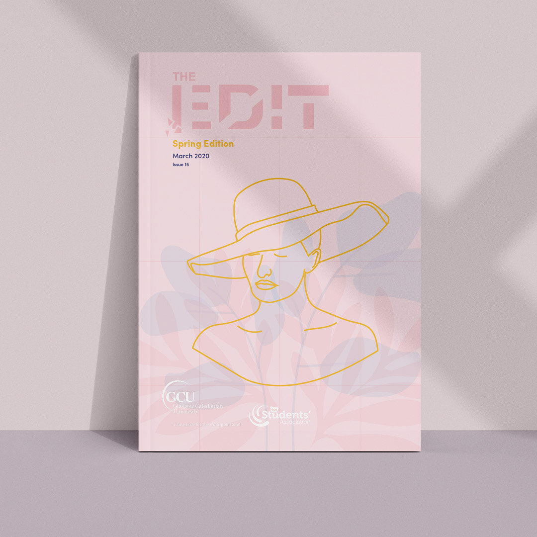
We decided to create three editions - one every two months of our last year of university. I lead the first edition before giving the responsibility over to Craig for the second edition. This way, the designers got to decide on a style each and challenge ourselves to follow a specific style.
The first issue
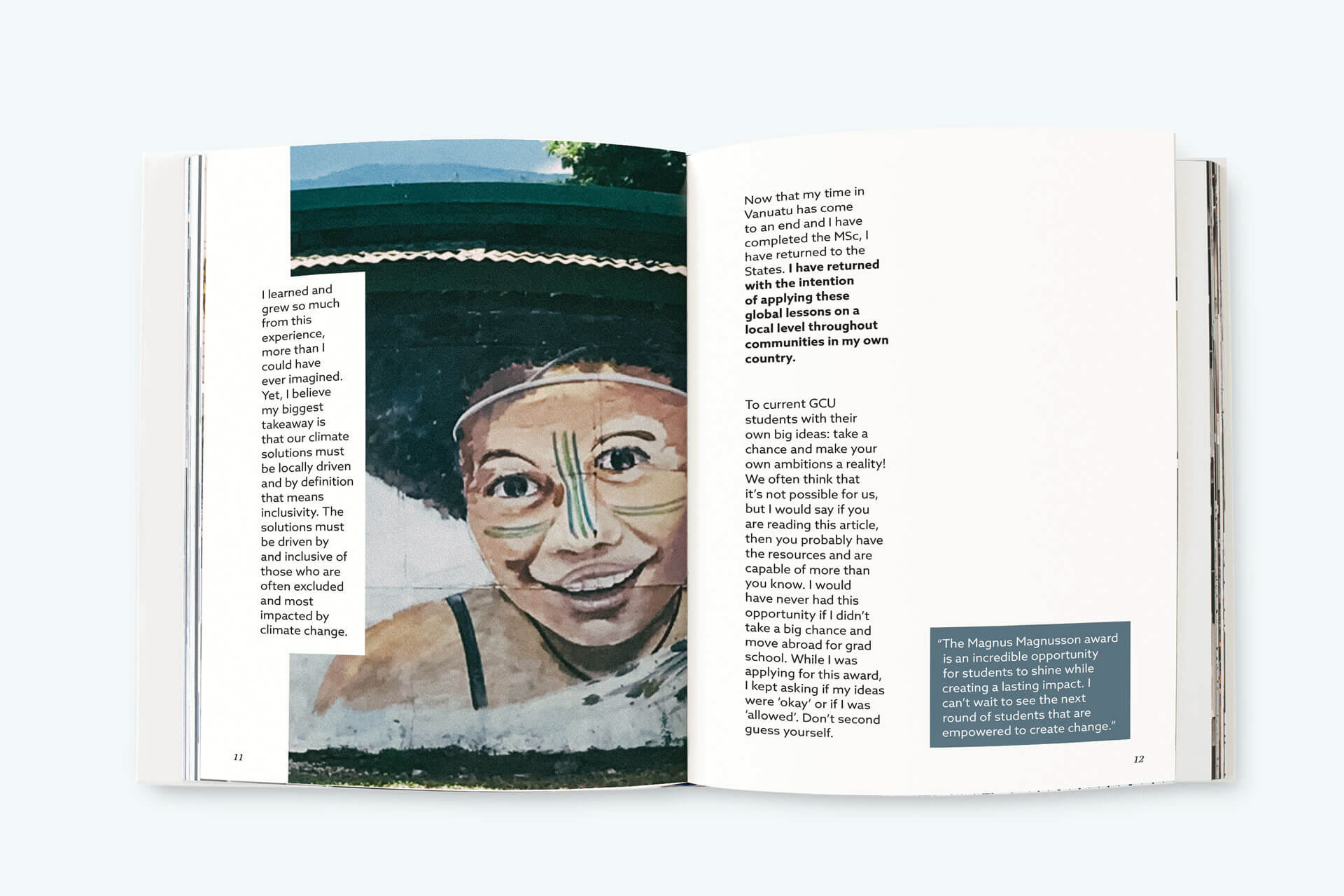
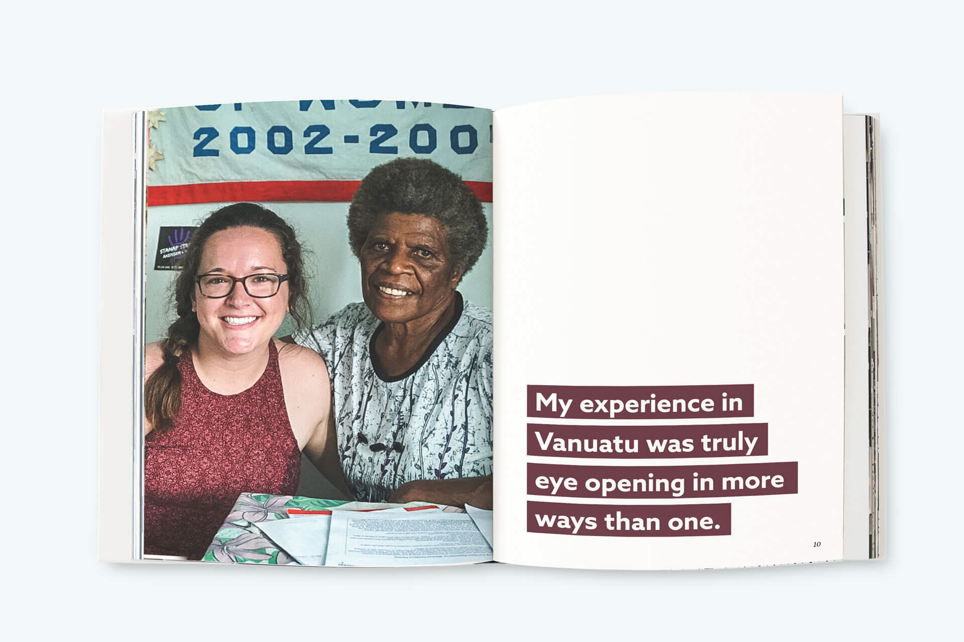
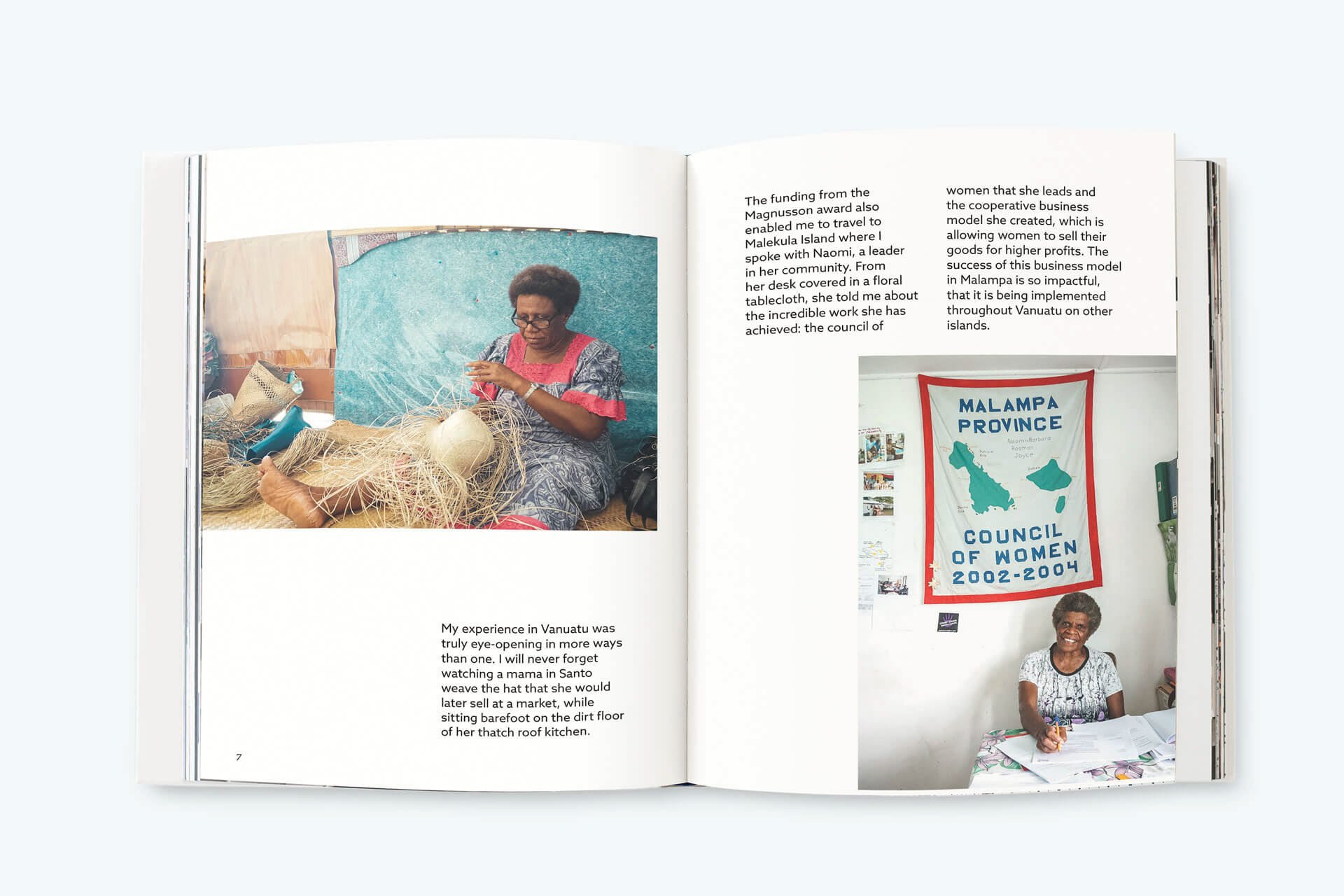
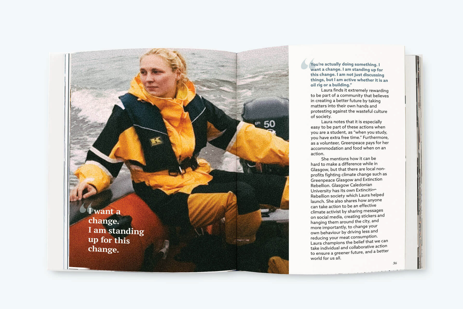
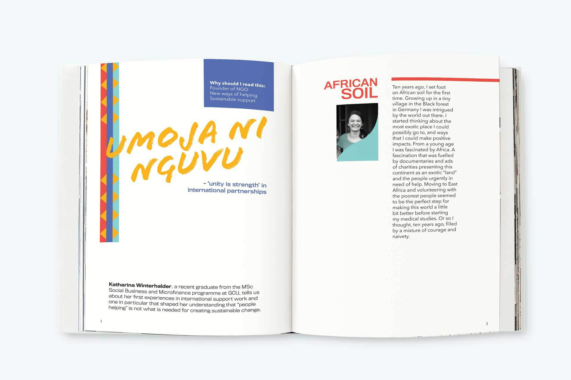
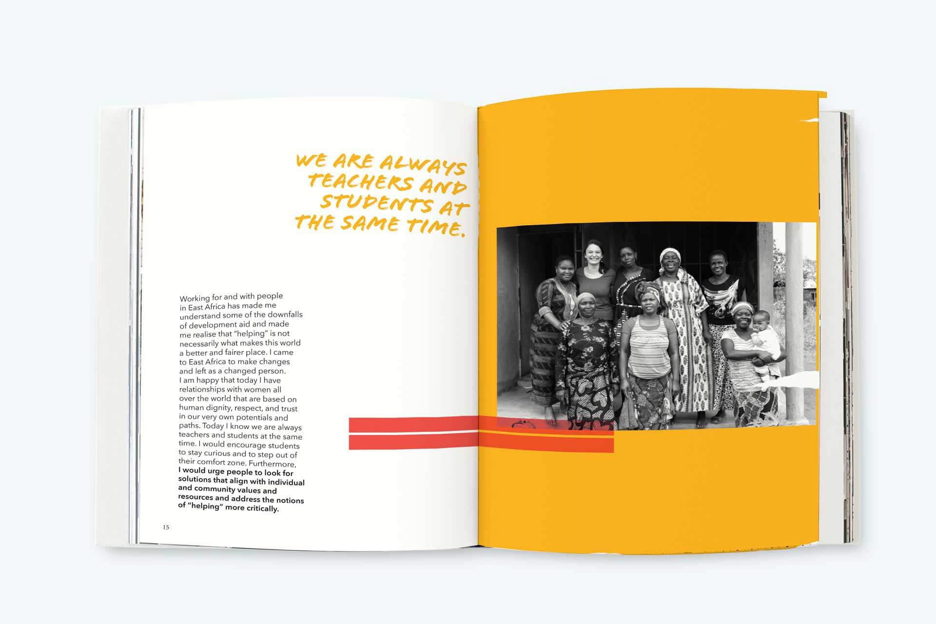
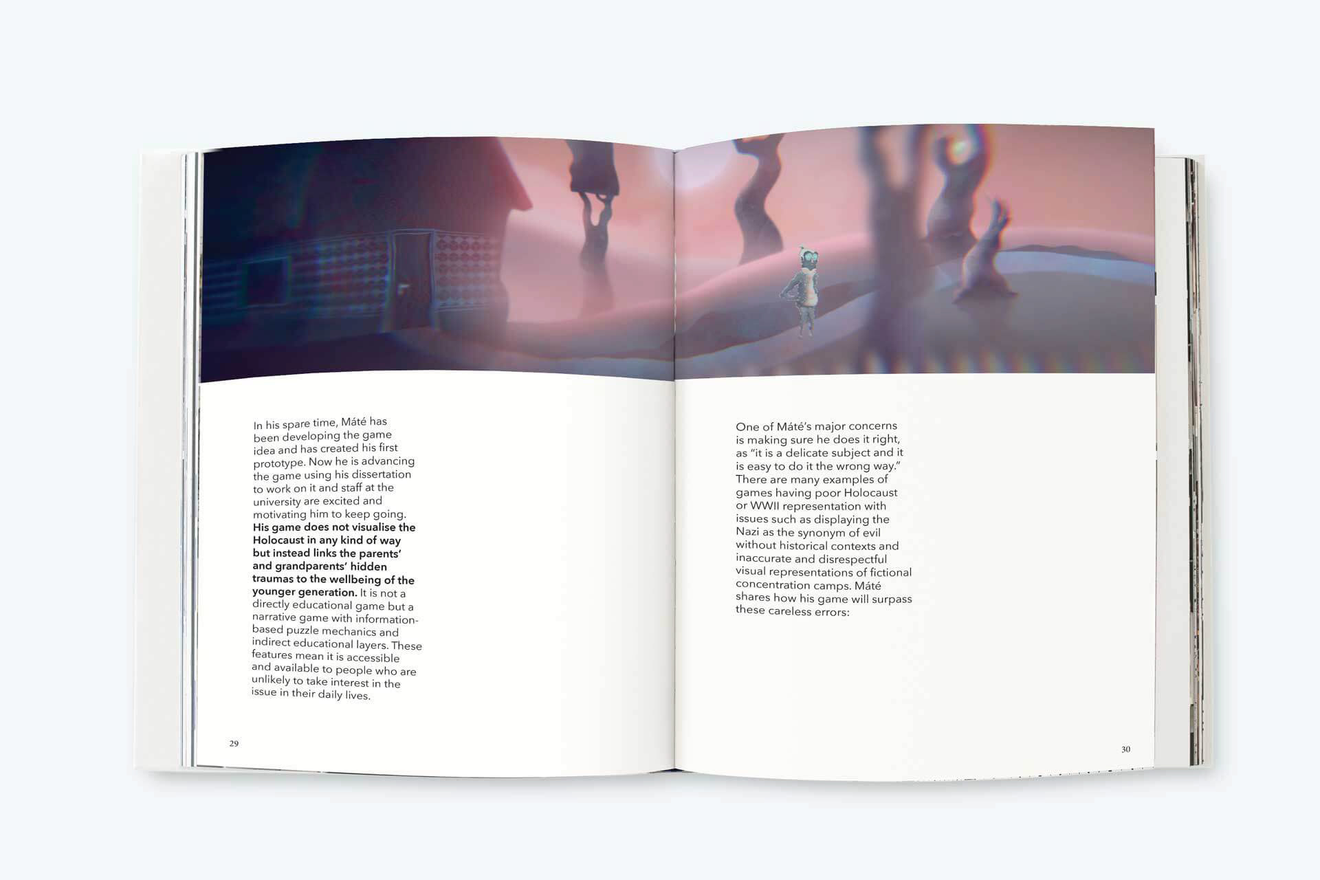
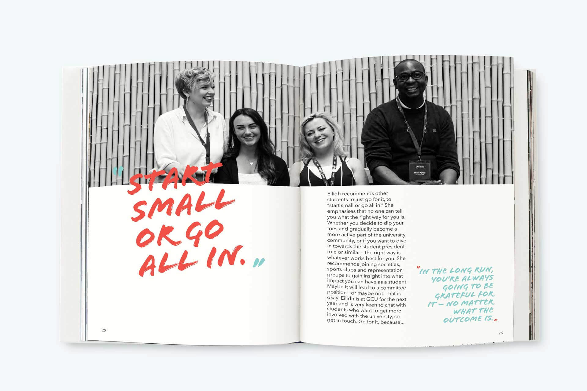
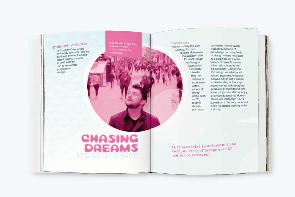
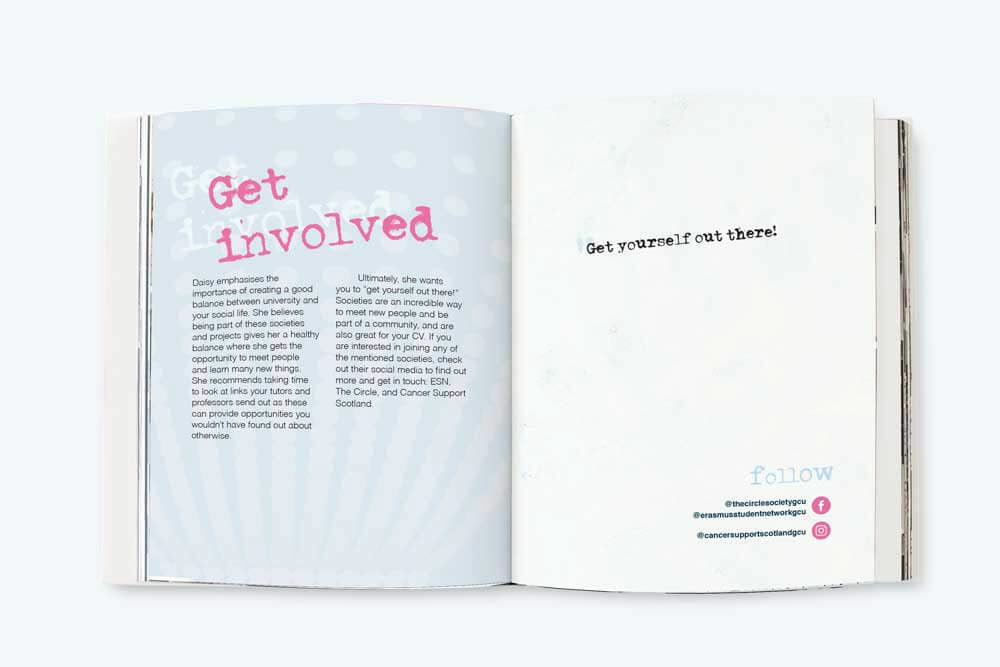
I was in charge of the visual style for the first edition. Here I chose a minimal layout with text in columns, quotes, and large images.
My favourite layouts from the three editions can be found in the gallery below.
